
- PEOPLE REMEMBER
- BRANDS, NOT BUSINESSES
Let’s make your business a brand.


Fat Frog Branding & Design Studio, We specialize in crafting unique, high-quality packaging solutions that not only Safeguard your products but also enhance your brand’s identity.
Brand Identity Design
Brand Strategy
Communication Creative Design
“Your Next Chapter in Fitness Begins Here”
We’ve revitalized our space with modern equipment, expanded training zones, and a reinvigorated atmosphere that honors our heritage while embracing the future of fitness. From personalized training and dynamic group classes to wellness coaching and recovery lounges, we’re redefining what it means to feel at home in your health journey.
The visual branding and communication lacked the vibrancy and energy expected by today’s health-conscious audience, making it harder to attract younger demographics.
The old identity failed to convey a clear, unified message. This led to confusion about our core values and offerings, especially as we expanded our services.
The previous design language was not optimized for digital platforms, affecting engagement on social media, websites, and mobile apps.
In a market full of dynamic and visually compelling brands, our dated identity made it challenging to stand out and compete effectively.
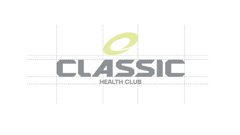
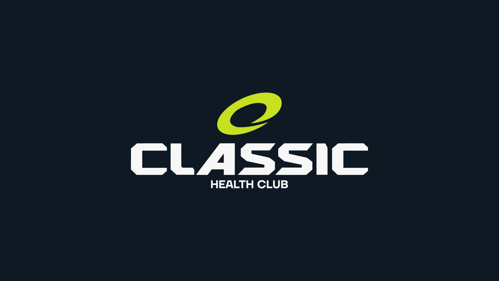
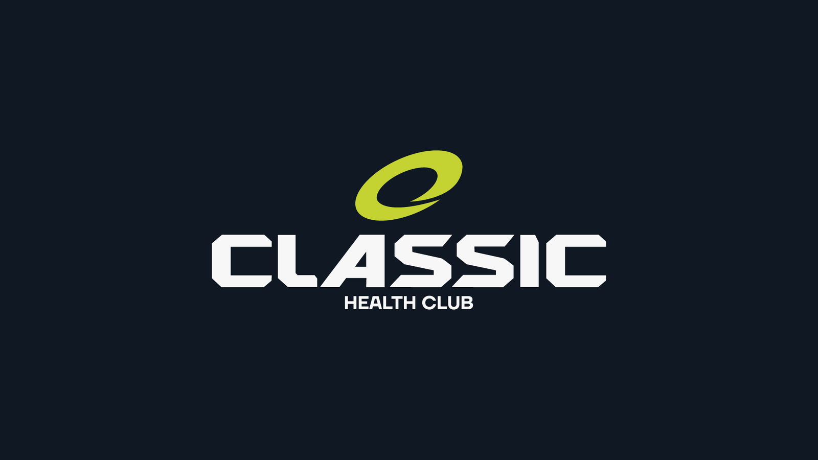
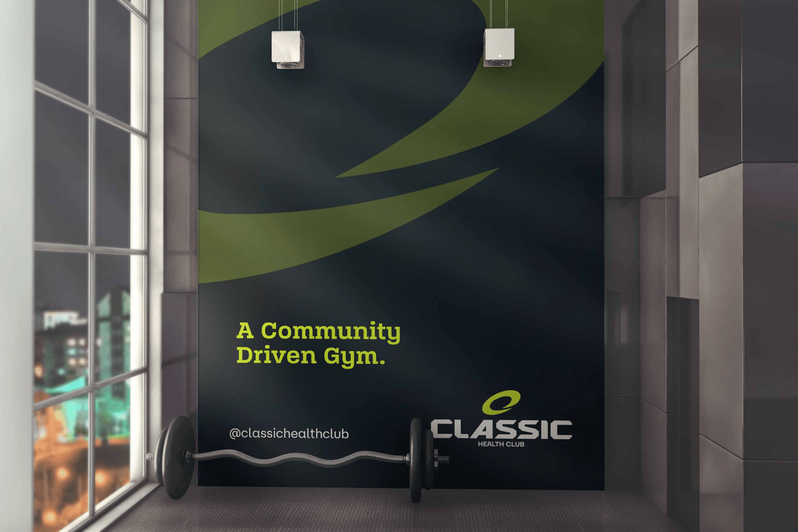
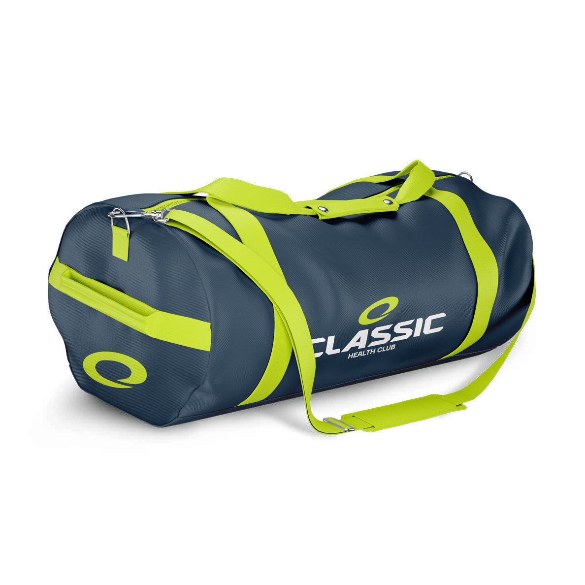
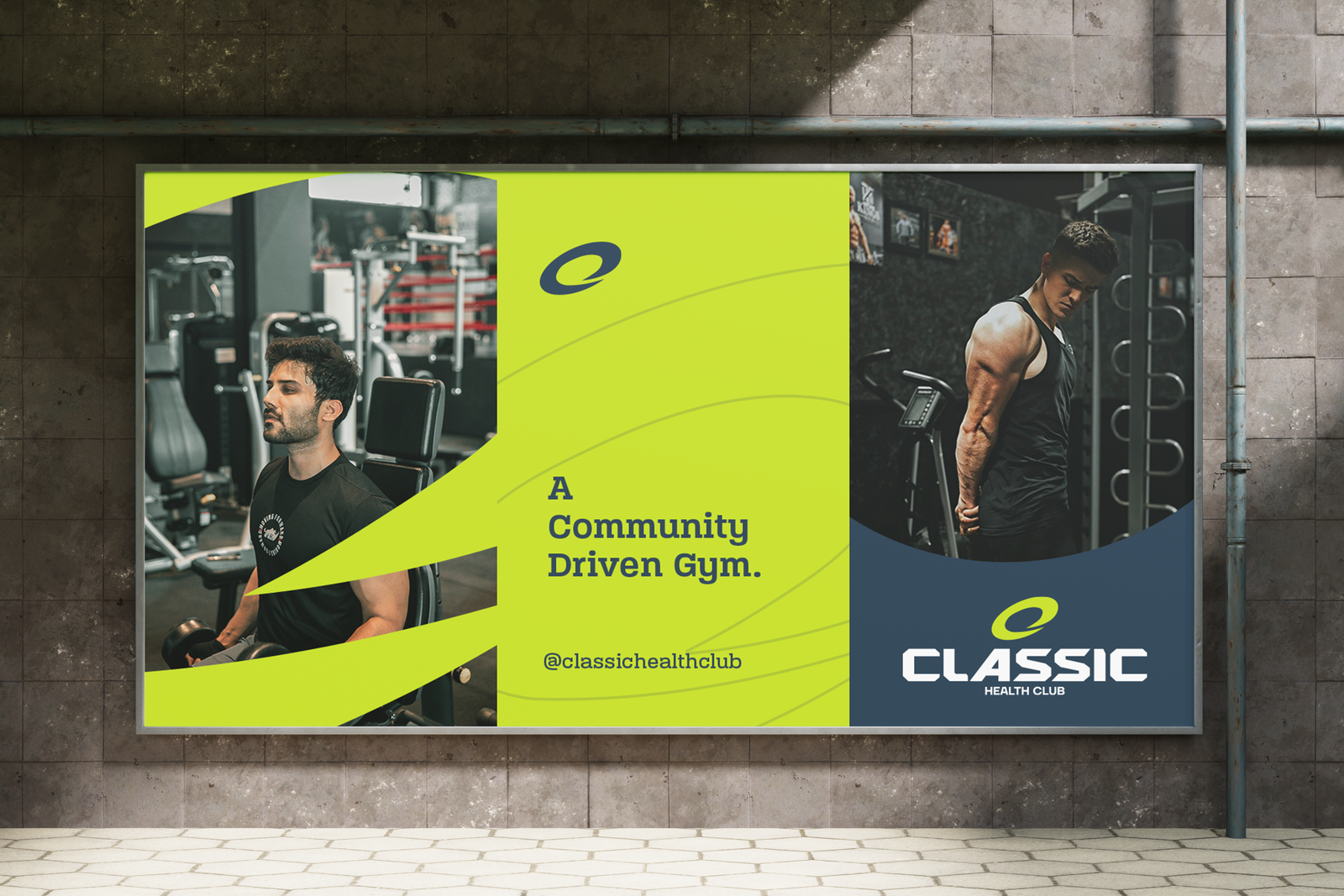
The word “CLASSICˮ is set in a bold, geometric, custom typeface – larger and more dominant than the descriptor below. This is intentional. It positions “Classicˮ not just as a name, but as a powerful, standalone brand built on decades of trust and strength.
The subtitle “HEALTH CLUBˮ is kept in a smaller, clean, modern typeface. This supports the main brand name without overpowering it, clarifying the category (fitness/wellness) while keeping the focus on “Classicˮ as the hero brand.

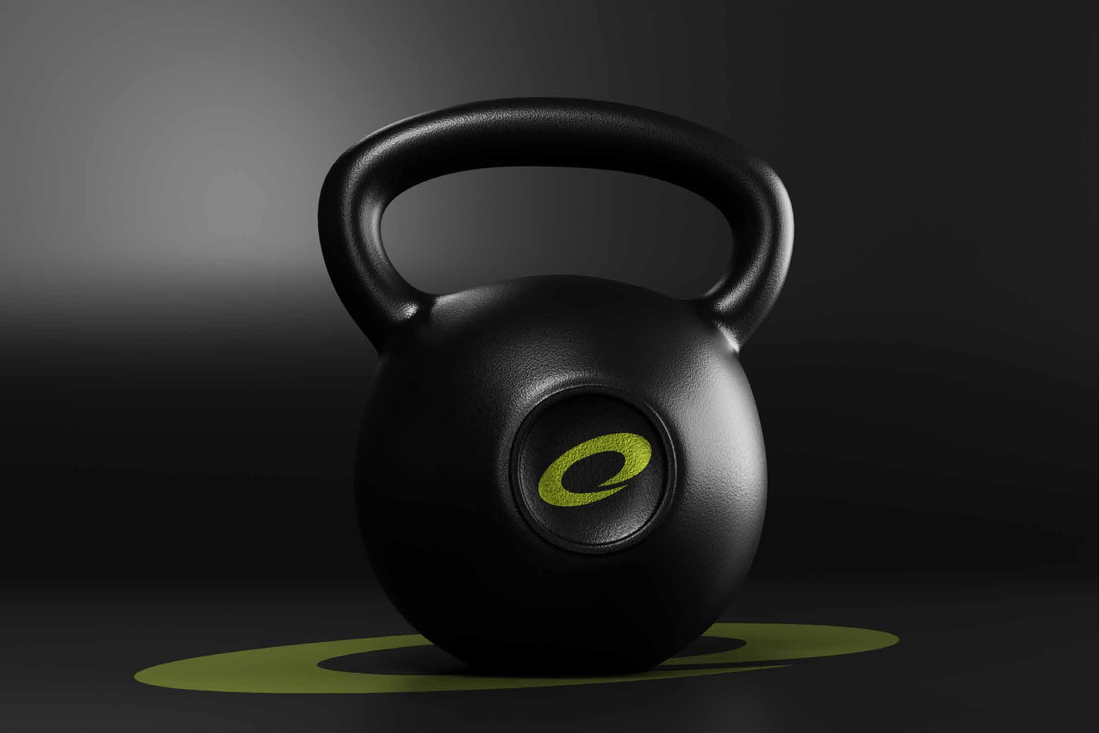
The bold “Cˮ as a mark in identity is designed
as a cyclic motion, symbolizing Continuous
Transformation and Community.
The brand identity for Classic Health Club will embody a timeless fusion of wellness, discipline, and sophistication. Drawing inspiration from vintage athletic aesthetics and modern fitness culture, the design will reflect strength, balance, and heritage.
Typography across brand materials will prioritize clarity with elegant spacing and strong hierarchies. Brand imagery will focus on confident individuals engaged in mindful training, with natural lighting and minimalistic backgrounds that emphasize human strength and wellness. Overall, the identity will position Classic Health Club as more than a gym as a lifestyle destination where discipline meets elegance, and fitness becomes a legacy.
Classic Health Club is a wellness brand rooted in timeless fitness principles, offering a disciplined and holistic approach to health in a modern, sophisticated environment. It blends the heritage of traditional training with contemporary wellness science to attract individuals who value long-term well-being over fleeting trends. Designed for professionals and purpose-driven individuals, Classic Health Club fosters a culture of consistency, strength, and personal growth, positioning itself as a refined alternative to trend-focused gyms. The brand stands for authenticity, quality, and enduring health promoting wellness as a lifestyle, not a phase.
A key challenge for Classic Health Club lies in differentiating itself within a highly saturated fitness market dominated by trend-driven gyms, budget chains, and boutique studios. While the brand’s focus on timeless wellness and disciplined training appeals to a niche audience, communicating this unique value in a way that resonates emotionally and stands out visually can be difficult. Additionally, changing consumer habits with a growing demand for convenience, digital workouts, and fast results may conflict with the brand’s slower, more intentional approach to health. Balancing modern expectations with the brand’s classic ethos, while building a loyal community, is essential to overcoming this challenge.
A Classic Health Club where tradition meets transformation. As we rebrand and evolve, our mission remains rooted in empowering every individual to live a stronger, healthier life. With a fresh new look, enhanced facilities, and a renewed commitment to excellence, Classic Health Club is more than just a gym it’s your wellness destination.
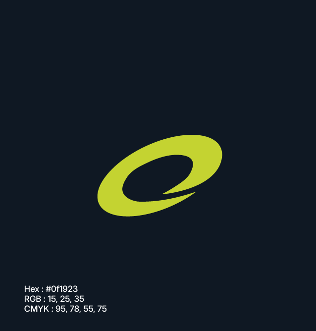
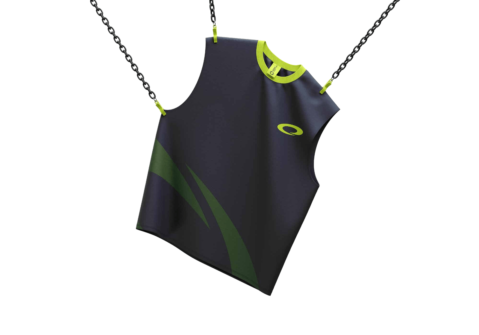
Represents strength and discipline – core values in the fitness journey.
Best for: Primary backgrounds in signage, digital interfaces, and merchandise for bold contrast.

Represents energy and growth reflecting empowerment through strength, movement, and wellness.
Best for: Highlights, call-to-actions, and brand accents to attract attention and reflect vibrancy.

Represents trust and professionalism – ideal for building member confidence.
Best for: Secondary backgrounds, uniforms, and print materials to maintain balance

WhatsApp us
Let’s make your business a brand.